Logix Platform October 2020 release


We have revamped our UI to be much lighter and mobile responsive. The lighter UI will means faster loading and easy working.
We have revamped the left menu bar which is more lighter and fast responsive.

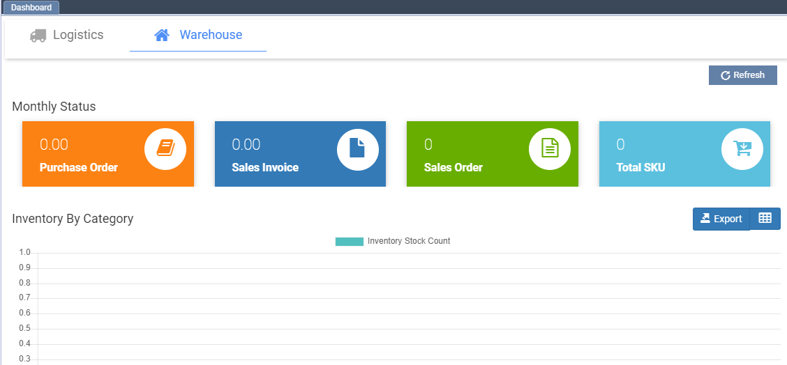
You can see the Warehouse dashboard now on the home page of erp.
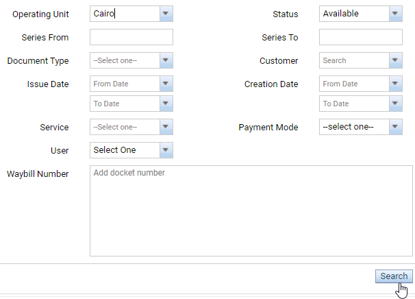
We have made the search table more easy, clean and fast responsive.
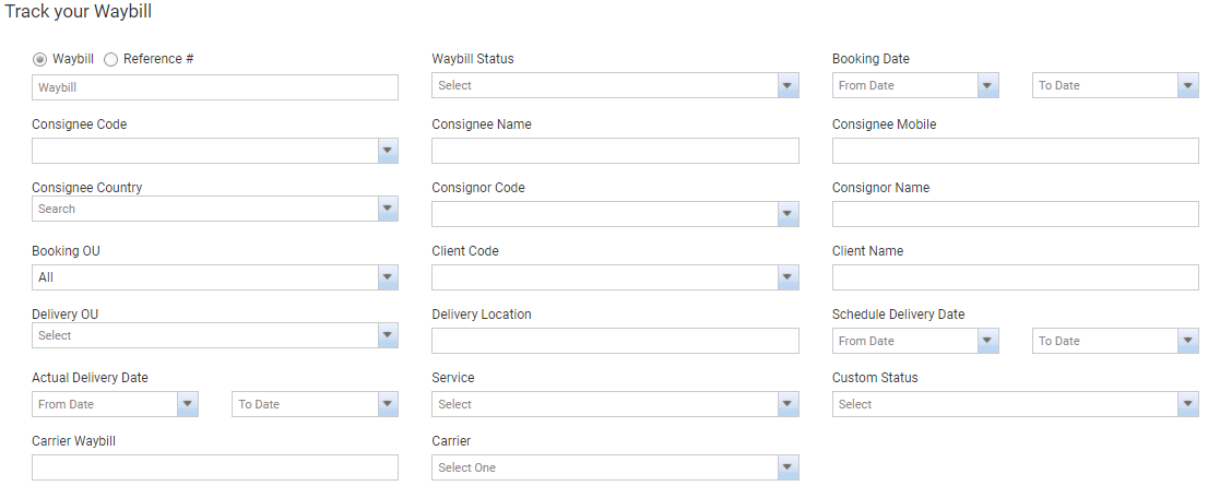
We have increased form fields font size and made it more clear.
We have made changes in suspend and activate icons. If there is a red icon showing in front of any customer / contract, it means it is suspended and green icon shows it is running in the system.

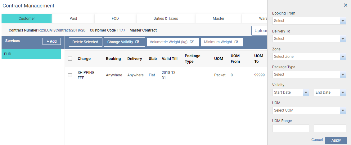
We have removed popups and added a right bar which is more clean, easy and fast responsive.
Action bar is now more clear and fast responsive.

Bottom bar is now more clear and fast responsive.
